Colourful greeting
Date published: 10 February 2010

Visitors to the borough will receive a smarter, more colourful welcome as the 30-year-old signs are replaced
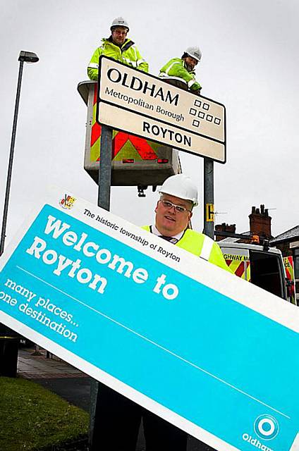
OLDHAM’S shabby black and white boundary signs are to be replaced, giving visitors a more colourful welcome.
The current signs feature the council’s old logo of seven squares and have been in place for more than 30 years. The new signs will include the latest logo — a turquoise spherical design — and carry straplines such as “many places, one destination”.
The name of each township will be made more prominent and the historic nature of each area will be recognised.
Council leader Howard Sykes, pictured helping to install the first new sign in Rochdale Road on the Royton/Rochdale boundary, said: “The design of the old signs dates from the 1970s, they were starting to look dated and were due to be replaced. The new signs are smarter, colourful and present our borough as a more modern, more confident place.”
Most Viewed News Stories
- 1Suspected human trafficking uncovered after house collapse
- 2Inside Oldham’s new market
- 3Police arrest 11, seize drugs and £70k cash in early morning strikes against organised crime
- 4Tommyfield Outdoor Market approved for use as new Eton-backed school
- 5Heartbroken wife of man who died following a collision on Broadway has paid tribute to 'her rock'


